The principles of design are fundamental rules that guide how to arrange visual elements to create effective, harmonious, and engaging compositions. They function as a framework, similar to grammar in language, ensuring visual information is clear and aesthetically pleasing whether in graphic design, web, or art.
In this article, we explore each principle through specially crafted AI-generated black and white photographs that embody the cinematic, modern aesthetic described in our image generation guide. Each photograph uses sleek futuristic geometric shapes, subtle digital connections, light reflections on glass surfaces, and deep contrasts (chiaroscuro) to visually communicate the essence of each design principle.
Balance
Balance refers to the distribution of visual weight in a design. Elements can be balanced symmetrically (mirrored) or asymmetrically (different elements with equal visual weight).
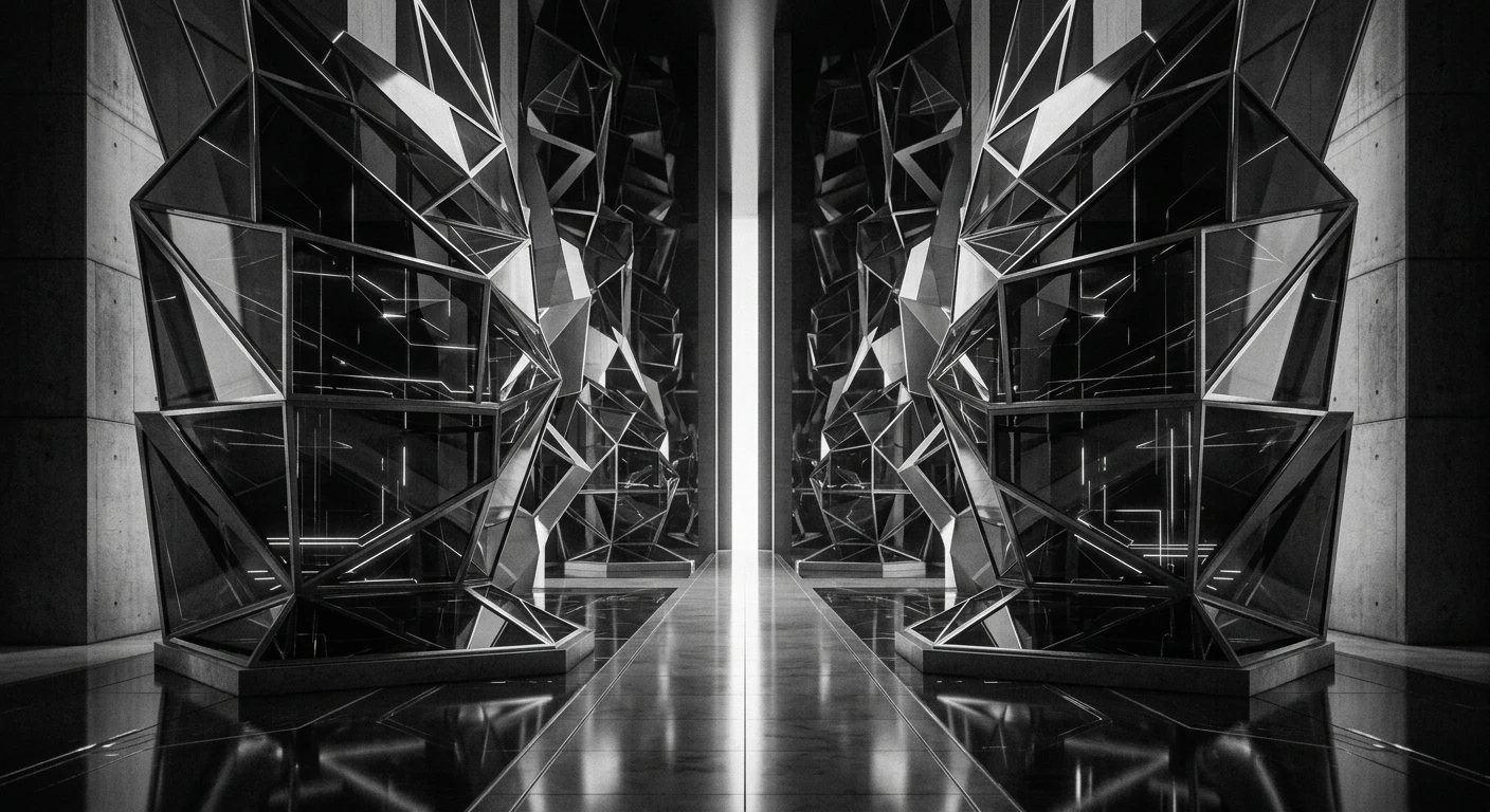 A cinematic, modern, black and white photograph representing balance in design. The image features symmetrical futuristic geometric shapes on either side of a central axis, with subtle digital connections and light reflections on glass surfaces creating equilibrium. Deep contrasts (chiaroscuro) emphasize the harmonious distribution of visual weight. No text.
Symmetrical balance creates stability and formality while asymmetrical balance offers dynamism and visual interest. In the image above, the mirrored geometric forms demonstrate symmetrical balance while the varying sizes and positions of connected elements create asymmetrical equilibrium.
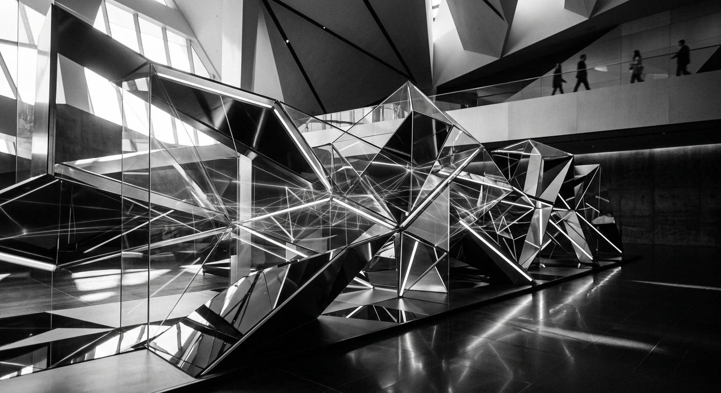
Contrast
Contrast involves arranging opposite elements (light versus dark, rough versus smooth, large versus small) to create visual interest and hierarchy.
 A cinematic, modern, black and white photograph representing contrast in design. The image juxtaposes sharp angular geometric forms with soft, flowing curves creating visual tension through opposing elements. Light reflections on glass surfaces highlight the interplay between bright and dark areas while subtle digital connections bridge the contrasting elements. Deep chiaroscuro lighting emphasizes the dramatic differences. No text.
Effective contrast guides the viewer's eye to important elements and creates visual drama. The photograph above uses opposing geometric forms (rigid angles versus organic curves) to demonstrate how contrast creates visual hierarchy and engagement.
Emphasis
Emphasis creates a focal point that draws attention to the most important element in a composition.
 A cinematic, modern, black and white photograph representing emphasis in design. A single prominent geometric form rises from a field of smaller, receding shapes creating a clear visual hierarchy. Light reflections converge on the central element while subtle digital connections radiate outward like ripples. Deep shadows recede from the focal point enhancing its prominence through chiaroscuro lighting. No text.
Through scale, color, position, or other visual characteristics, emphasis ensures viewers notice what matters most. The central, illuminated geometric form in this image commands attention while the surrounding elements provide context without competing for focus.
Movement
Movement guides the viewer's eye through a composition creating a sense of action or direction.
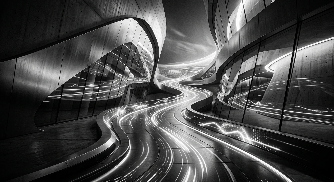 A cinematic, modern, black and white photograph representing movement in design. Sweeping curved geometric forms create a flowing pathway that leads the eye from foreground to background. Subtle digital connections pulse with energy along this path while light reflections on glass surfaces follow the directional flow. Contrasting light and dark areas create rhythm within the movement. No text.
Whether through actual motion or implied direction, movement creates visual flow and prevents stagnation. The sweeping curves in this photograph create a visual journey with light and shadow patterns reinforcing the sense of forward momentum.
Pattern
Pattern involves repeating elements in a regular or irregular arrangement to create visual interest and unity.
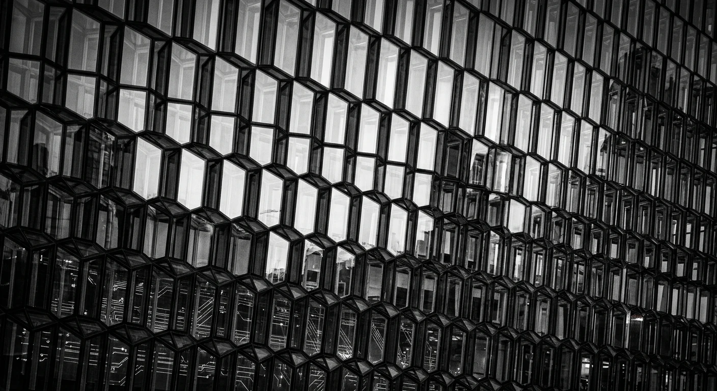 A cinematic, modern, black and white photograph representing pattern in design. Repeating geometric shapes create a rhythmic tessellation that extends across the frame, with subtle variations preventing monotony. Light reflections on glass surfaces highlight the repeating elements, while digital connections form a secondary pattern beneath the primary arrangement. Deep contrasts emphasize the regularity of the repetition. No text.
Patterns create visual rhythm and can be either predictable (regular) or surprising (irregular). The tessellating geometric forms in this image establish a visual rhythm, while subtle variations in size and orientation prevent the pattern from becoming monotonous.
Rhythm
Rhythm creates a sense of organized movement through repeated elements with variations, similar to musical rhythm.
 A cinematic, modern, black and white photograph representing rhythm in design. Alternating large and small geometric forms create a visual beat that pulses across the composition. Light reflections on glass surfaces intensify and diminish in sequence, while subtle digital connections throb with periodic energy. Deep shadows and highlights follow the rhythmic pattern. No text.
Like music, visual rhythm uses repetition with variation to create expectation and surprise. The alternating large-small pattern in this photograph establishes a visual tempo, with light and shadow reinforcing the rhythmic progression.
Proportion
Proportion refers to the relationship between the sizes of different elements in a composition.
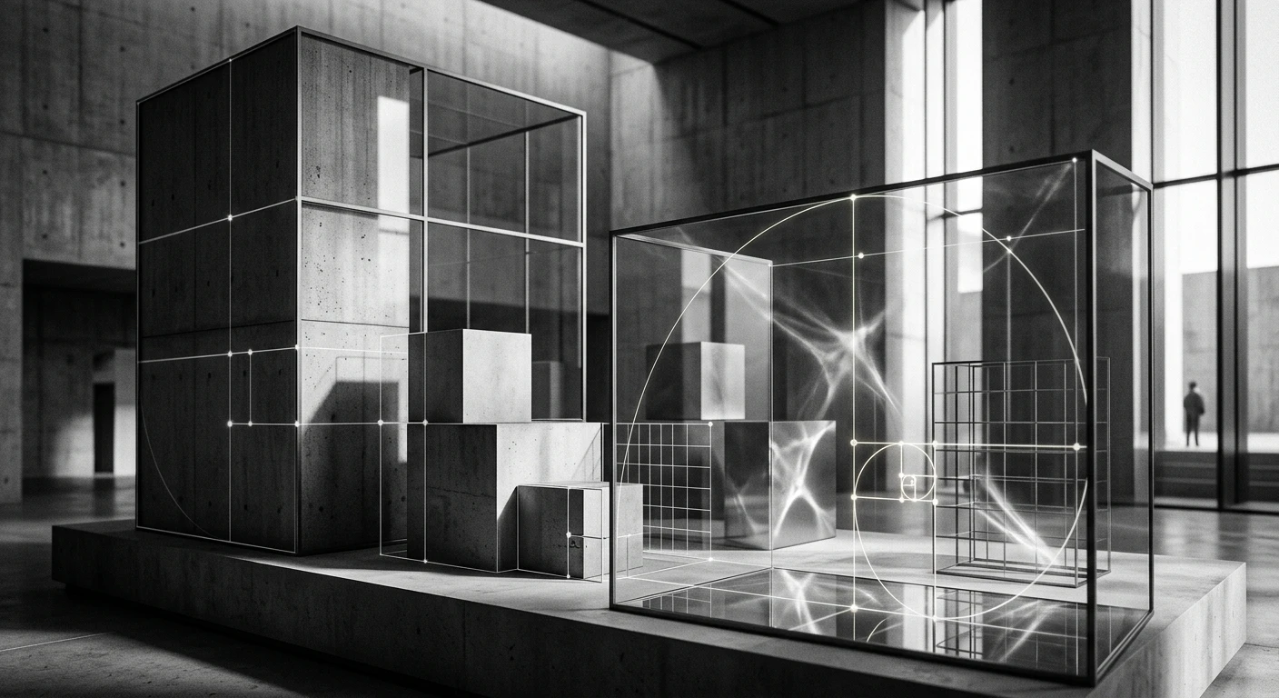 A cinematic, modern, black and white photograph representing proportion in design. Geometric forms of varying scales relate to each other through clear mathematical relationships (golden ratio, rule of thirds). Subtle digital connections illustrate the proportional relationships, while light reflections on glass surfaces highlight the harmonious scaling. Deep contrasts emphasize the size relationships between elements. No text.
Good proportion creates harmony and avoids elements that feel either too dominant or insignificant. The varying geometric forms in this image relate through clear mathematical ratios, demonstrating how proportional relationships create visual harmony.
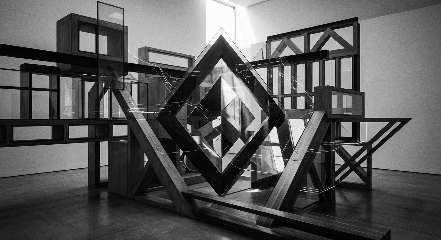
Unity
Unity (or harmony) ensures all elements work together cohesively to create a sense of completeness.
 A cinematic, modern, black and white photograph representing unity in design. Diverse geometric forms (angles, curves, and polygons) coexist harmoniously through shared visual language and consistent lighting. Subtle digital connections bind the elements into a cohesive whole while light reflections on glass surfaces unify the surface treatment. Deep chiaroscuro lighting creates consistent mood throughout. No text.
Unity prevents designs from feeling chaotic or disjointed. Despite their different forms, the geometric elements in this image feel connected through consistent lighting, material treatment, and visual language creating a cohesive composition.
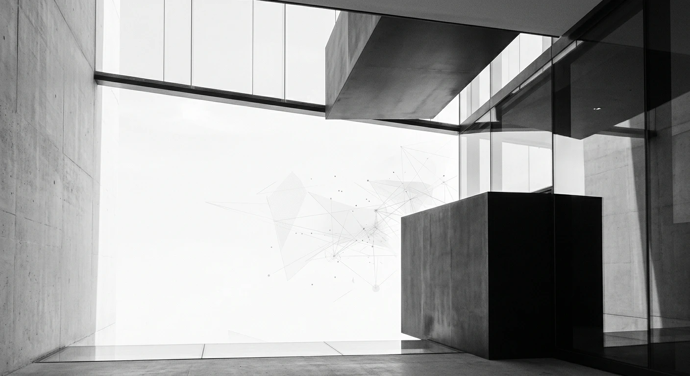
White Space
White space (or negative space) is the empty area around and between elements that provides breathing room and improves readability.
 A cinematic, modern, black and white photograph representing white space in design. Bold geometric forms float in expansive areas of light and shadow with careful attention to the relationships between form and emptiness. Subtle digital connections hover in the negative space suggesting potential rather than occupation. Light reflections on glass surfaces define the boundaries between form and space. Deep contrasts emphasize both the presence of elements and the importance of what surrounds them. No text.
White space is not merely "empty" but an active design element that enhances comprehension and visual comfort. The generous areas of light and shadow surrounding the geometric forms in this image demonstrate how negative space defines and elevates the positive elements.
Applying the Principles Together
While each principle can be examined individually, great design emerges from their thoughtful combination. The most effective compositions balance multiple principles simultaneously using contrast to create emphasis within a unified whole, guided by rhythm and movement, all resting in appropriate proportion with generous white space.
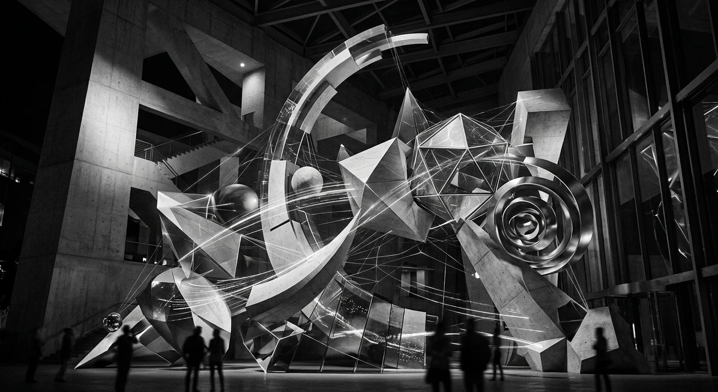
 A cinematic, modern, black and white photograph representing the integration of all design principles. Multiple geometric forms interact through balanced composition, contrasting elements, clear emphasis, flowing movement, repeating patterns, rhythmic progression, proportional relationships, unified harmony, and thoughtful use of white space. Subtle digital connections weave through the composition while light reflections on glass surfaces highlight the interplay of all principles. Deep chiaroscuro lighting creates depth and dimension. No text.
Understanding and applying these principles allows designers to create work that is not only visually appealing but also communicates effectively and provides meaningful user experiences. Whether designing websites, graphics, products, or environments, these timeless principles remain essential tools for visual communication.
By studying these AI-generated interpretations of each principle, designers can develop a deeper intuition for how to apply these concepts in their own work, creating compositions that are both aesthetically pleasing and functionally effective.